Table of Contents
We recently hosted the seventh edition of Short Talks, an internal event where team members share their insights and knowledge about their topics of choice.
We organize Short Talks as monthly 2-hour online meetings for over a year now.
Such moments are a great opportunity for the team to learn, spread knowledge, and get to know each other better.
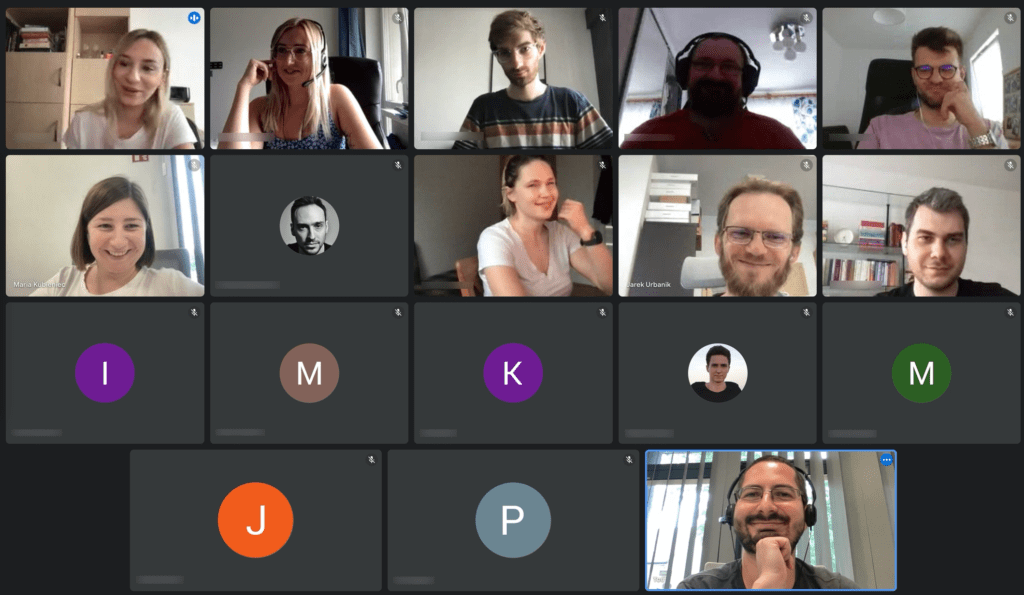
This edition in particular was so special that we would like to share on the blog some of the knowledge. Why the highlight?
- We had a special guest speaker
- Great combination of professional and fun insights
The topics were
- «framing» / how the mind can work (against you..)
- How to listen to music (spoiler: you choose)
- Cheap traveling
- 3D illustrations in UI
Presentations Summary
1. «framing» / how the mind can work (against you..)
By Joost Beerling, CEO of Sunsense
Joost Beerling, CEO of our partner Sunsense, kicked off his presentation with a prompt: “I’m going to ask you questions and you have to give me a wrong answer.”
Surprising, right? We can’t share the details here because that would spoil a very interesting thought exercise.
But the gist is: our brain is lazy because it constantly tries to simplify everything. Patterns make life possible… but also limit us.
So that’s why geniuses are geniuses, right? Because they are the ones that “think out of the box?”
Actually, everyone can practice expanding their frame of mind – in other words, thinking out of the box. That’s a learned skill and there are techniques to achieve it.
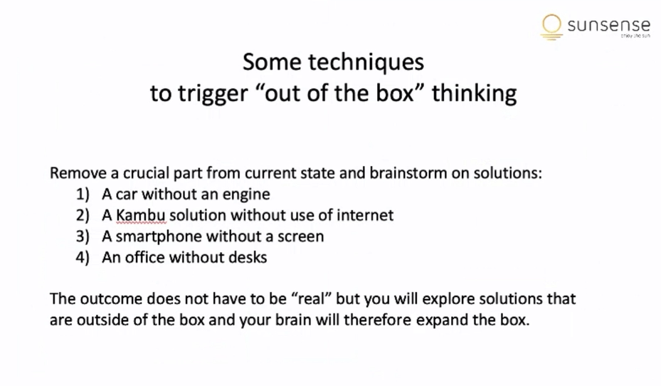
Joost presented some of these techniques and even applied them to a fictional Kambu project!
A great part of the presentation was how actionable the insight is. We are sure to put some of the techniques into practice during challenging meetings.
2. How To Listen To Music (Spoiler: You Choose)
By Carlos, Marketing
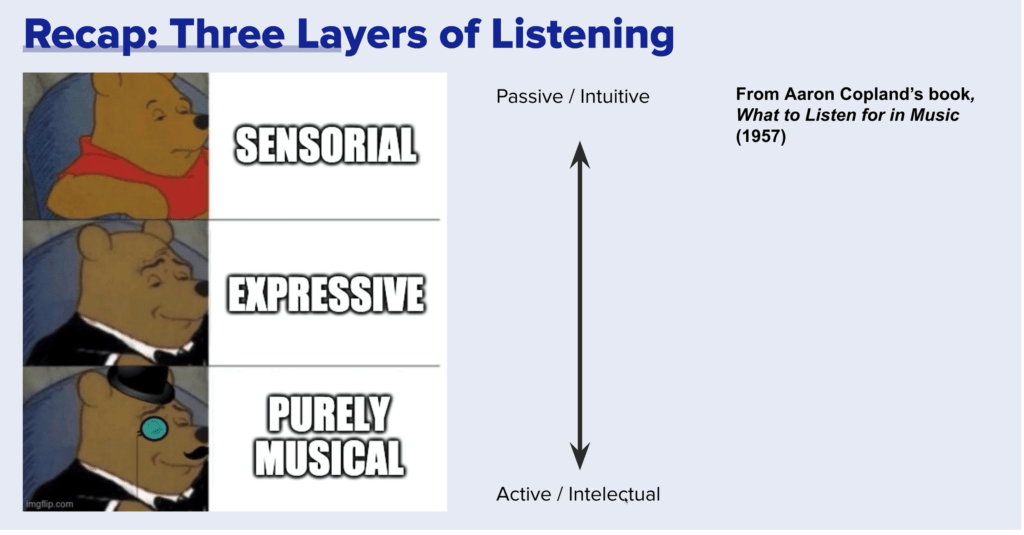
According to the late composer and teacher Aaron Copland, listening to music happens within three layers: sensorial, expressive, and purely musical.
As a music teacher, Copland favored a more intellectual approach, when we are able to actively listen to music. However, by thinking too hard, we might forget to feel the music!
Taken at face value, there’s no connection between listening to music and working at a software house.
Surprisingly, however, many listeners related with the “struggle” of thinking too much.
Some designers remember that, as they gain experience, they started perceiving and judging fonts, kerning, and evaluating color combinations everywhere. Even in unlikely places, from shop signs to business cards.
3. Cheap Traveling
By Karolina, PM
Is it possible to save over 80% when traveling? Karolina proved that yes, from plane tickets to accommodation, you can save as much.
She shared her stories of traveling to the UK, Iceland, Spain, Georgia, Jordan, and more, on a budget.
Karolina shared her four tips for traveling cheap:
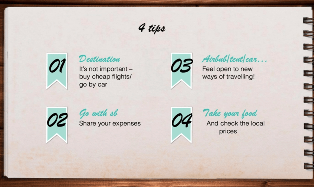
We all know that we can sacrifice a bit of comfort to save money. But she also talked about thinking about the price first: you can have a wonderful time exploring the first result in “cheap tickets now” searches.
Also, when traveling from a low-cost country, it just makes sense to take food with you.
Many teammates got excited about the tips. We talked about our favorite sites for flying: cheap airlines (Ryanair, Wizzair, etc.), price trackers and aggregators (Skyscanner, Kayak, Azair, etc.)
4. 3D Illustrations in UI (User Interface)
By Anna, Design
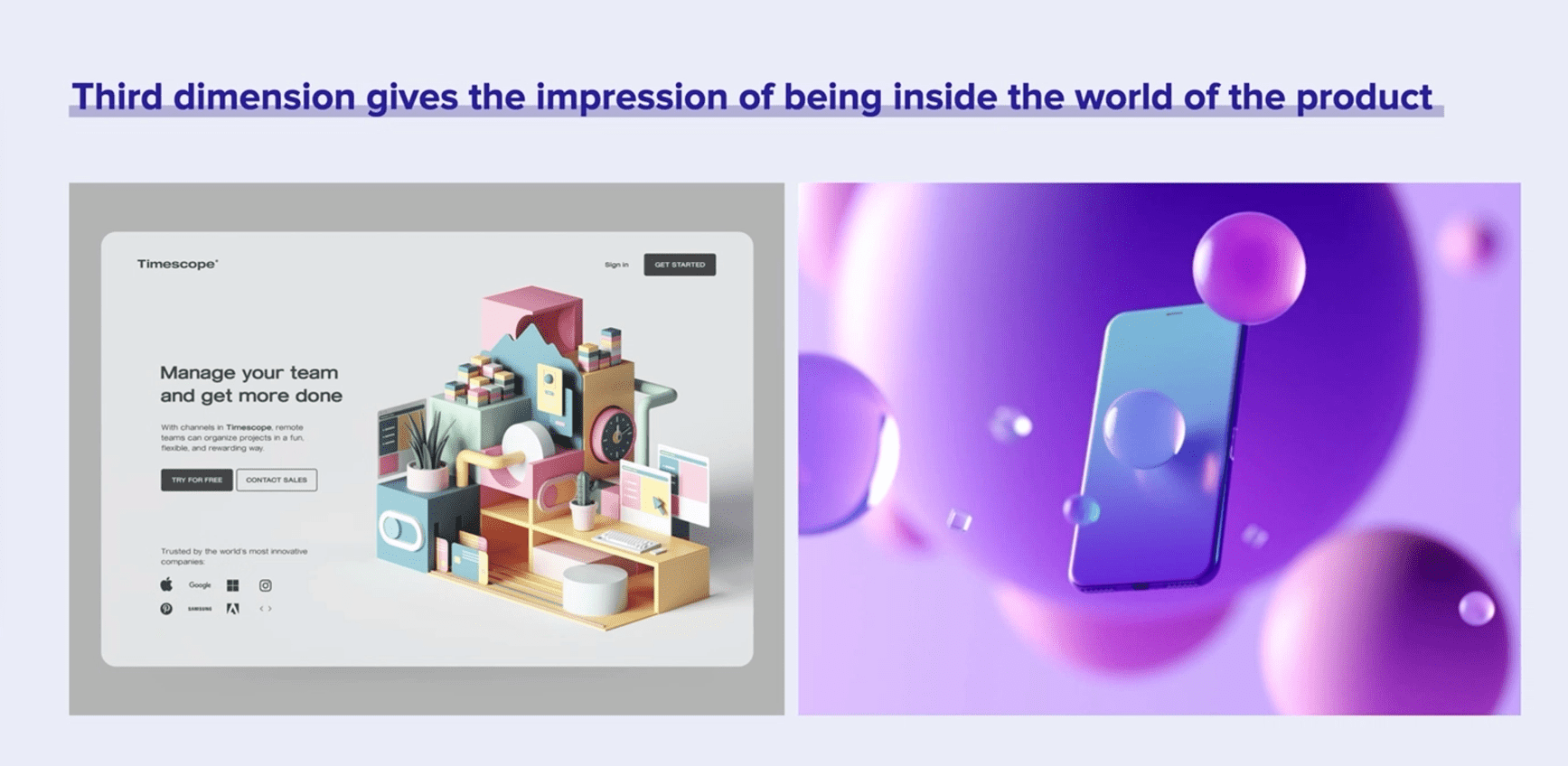
When used well, 3D design and branding assets can be more eye-catching than photos.
“The third dimension gives the impression of being inside the world of the product,” says Ania.
There are challenges, though, such as balancing many elements, colors, textures, and so on.
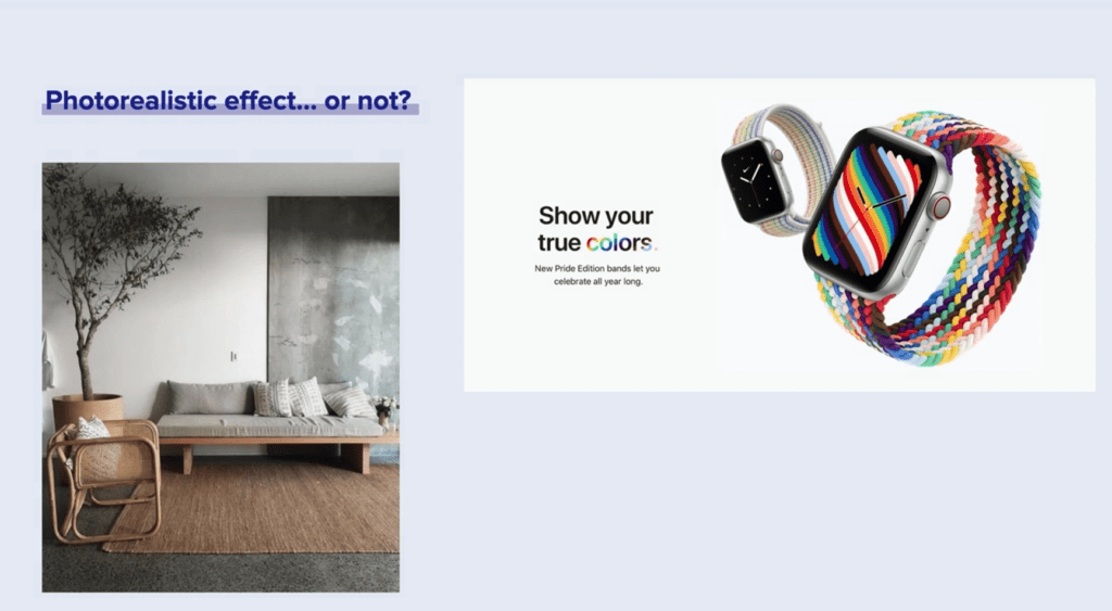
Good 3D artists can produce 3D artwork that is virtually indistinguishable from a real photo. This is often seen in internal design, for example.
But photorealism is not always the goal.
The official artwork for Apple Watch Pride edition is an interesting case. It’s not meant to be photorealistic. Rather, it deliberately uses colors and light to create the illusion of flawlessness.
It’s as if Apple were saying “this product is so good it’s better than reality”.
